Google Trends is great if you want to see whether your brand is doing better than your main competitor and to see how interest in your products, brands or “digital reason to be” varies over time. It becomes a little harder to use when you are conducting a full industry survey as there is a limit of 5 items that can be compared and no API so you can’t do it programmatically,
Let’s take a simple example and see how we can solve this problem. Imagine I am a fruit seller in Singapore and I am deciding which fruit are in greatest demand (in terms of search). Let’s have 8 possibilities: apple, pear, orange, banana, pineapple, mango, durian and jackfruit.
Let’s start by examining one fruit; the (in)famous local durian.
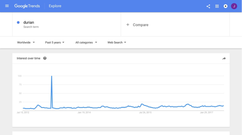
Our first graph shows the relative search volume every week over a five year period, graded between 100 when the searches were highest to 0. Google Trends does not show the actual search volume and so an individual result is not as informative than it might be. Let’s add another fruit.

Here durian is compared with apple. I have restricted the search to the “Fruits and Vegetables” category to avoid confusing fruit with technology companies. Now we can see the relative sizes of the search demand – apple is much more globally interesting than durian and exhibits great seasonal demand.
Now let’s look only at Singapore:

A very different picture; with apple searched much less and some seasonal interest in durian. Notice that any insights into apples is lost because of the relative importance of this local fruit: everything is scaled by the peaks in durian demand.
Now let’s add in a couple of additional fruit and change the time period to the last 90 days.

We’ve reached the limit of our 5 keywords (or brands) that can be compared. How can we work our which are the most popular fruit (on average) over the last 3 month period?
We need to create an addition trend graph that shares one keyword with the current graph. We will use apple and compare it with pear, pineapple and mango. You should try to use a middle ranking keyword that will appear in the middle of the pack in both graphs.

Now you can see the problem – how can we combine these results? The answer is to export and manipulate the data. The export function is on the top right and you should export as CSV and the import into numbers or excel. Here are the tops of each table side by side.

We still cannot do a direct comparison because our Apples in the first group have been scaled differently from the Apples in the second; we need to normalise the second group using the first as a reference.
We do that by calculating the average value of each column

New we equalise the averages in group 2 by multiplying every entry in group 2 by average apples group 1 / average apples in group 2. (This will scale the averages in group 2 to the same scale as group 1). I used a copy of the table to perform the maths.
We could now plot all of the data again but our answers are in the averages at the bottom of each column. In the last 90 days, Singapore has been searching for the following fruit in order of popularity.

This provides a model that can be applied to much larger sets of data and it’s well worth using this technique if you are trying to understand the relative demand for a range of search terms for your site or ecommerce store.


5 Comments
Hassan · 19/04/2019 at 23:40
Can we use the same formula for more than 2 groups of 5 products?
e.g. we have 4 groups of 20 keywords and we use this formula for 1st 2 group as it is and for remaining keywords we use the same pattern by picking middle ranking keyword. so will it be correct for analysis?
jonathanbriggs · 28/04/2020 at 14:09
Yes of course, simply repeat by overlapping each of the groups. It will take some time but worth it.
Nicholas William · 06/07/2020 at 11:51
How do I account for massive outliers without skewing my data?
envirosean · 20/07/2020 at 21:51
Related to the above question and using your example. If we had 4 groups of search terms (20 words in total), would you use Apple as the middle key word to include in each of the 4 groups when normalising?
Alex · 22/07/2020 at 01:39
I’m sure some entrepreneuring developer will eventually automate this process, but thank you Jonathan! This is a highly neglected question 🙂 Google trends is still pretty underutilized, which leaves us market/user researchers with a niche skill for now.